AI Lab website: bold samples, round 2

These are working samples built from the current site’s content; nothing is live, the starred ones are Claude’s picks, and the links open each page with motion switched on.

After round 1, each sample here was asked to lead with one bold idea taken from the lab itself (its name, its building on the river, its subject), carried by layout, type and motion together.

Claude’s picks, best first: M Two-Plate Overprint, T Lines from Babbio, P Data Double and N Turning Door.

Each pick was in the top four of at least two of three reviews: one judged the idea and how bold it is, one read the page as a company manager and as the professor, and one tested the motion and the build.

Round 2

Each card shows four moments of the page on a laptop, then its first screen on a phone. Click any picture to see it full size.
  1. Sample M: Two-Plate Overprint

    Claude’s first pick
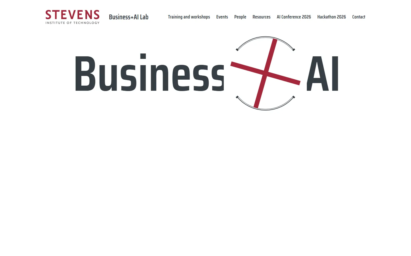
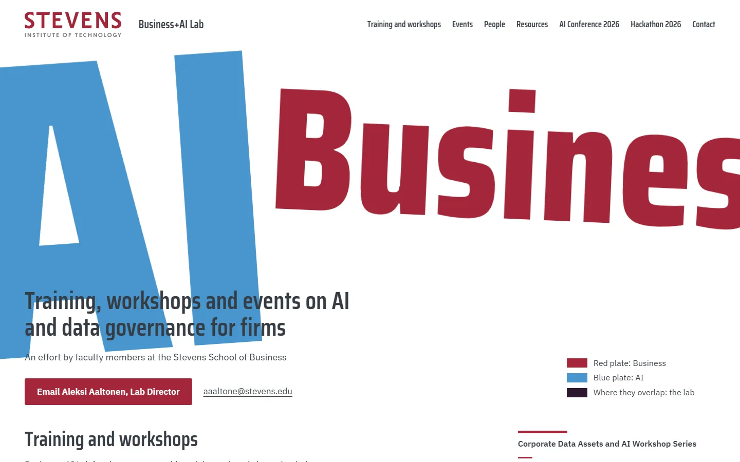
    1. Sample M on a laptop, moment 1: the two plates start apart1Load: the plates start apart
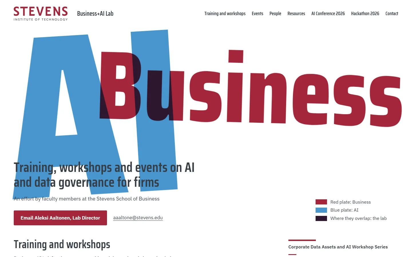
    2. Sample M on a laptop, moment 2: the plates cross and the overlap shows2The plates cross and the overlap shows
    3. Sample M on a laptop, moment 3: nearly in register3Nearly in register
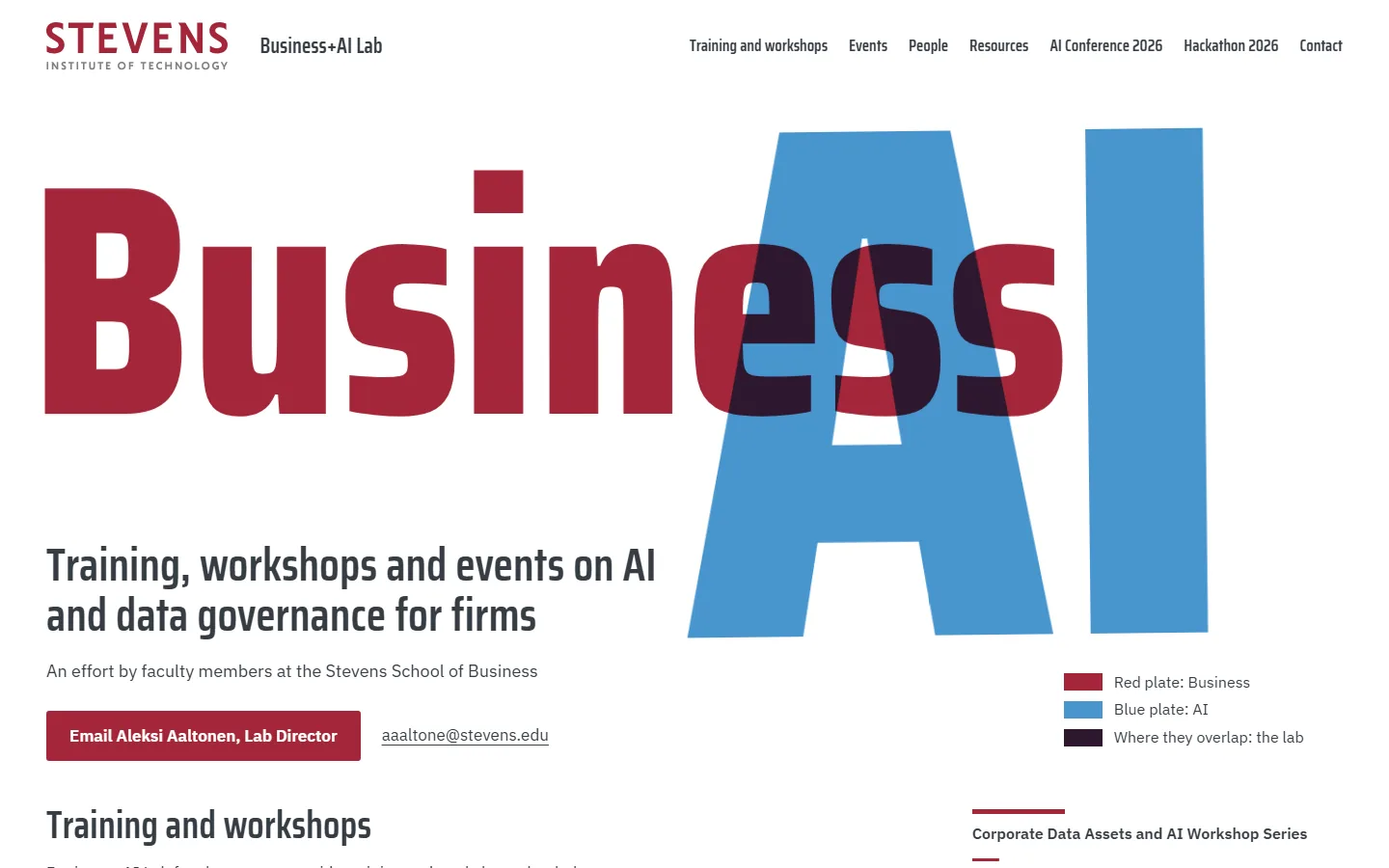
    4. Sample M on a laptop, moment 4: in register, at rest4In register, at rest
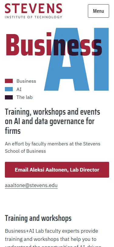
    Sample M, first screen on a phonePhone, first screen

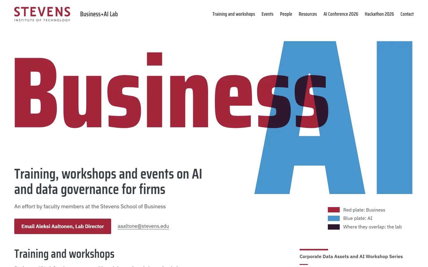
    The lab’s name printed as two inks: “Business” on a Stevens Red plate and “AI” on a blue plate, and where they overlap they make a dark third colour that stands for the lab. The plates slide into register as the page loads, and the same two inks carry each workshop (who it is for in red, its title in blue) down to the closing email band.

    Claude’s first pick. All three reviews scored it 7 or 8, and its idea, the overlap of two inks as the lab itself, carries furthest down the page, into every workshop and the closing email band.

    Steps outside the Stevens brand: the overlap makes a dark colour that is not in the Stevens palette, blue covers as much of the first screen as Stevens Red, and the giant words run about 18 to 33 times body size, set tilted and slightly off register.

  2. Sample N: Turning Door

    Claude’s fourth pick
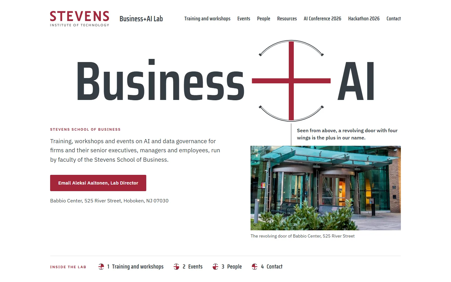
    1. Sample N on a laptop, moment 1: the door spins in on load1Load: the door spins in
    2. Sample N on a laptop, moment 2: at rest, the drawn door beside a photo of the real one2At rest, beside a photo of the real door
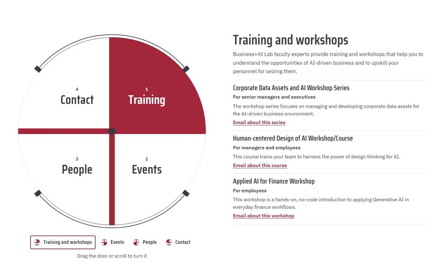
    3. Sample N on a laptop, moment 3: scrolling turns the door to Training3Scroll: Training comes round
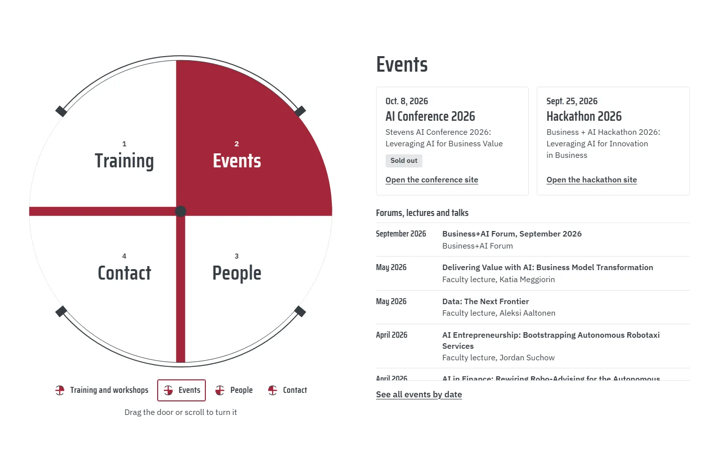
    4. Sample N on a laptop, moment 4: a quarter turn on, Events4A quarter turn on: Events
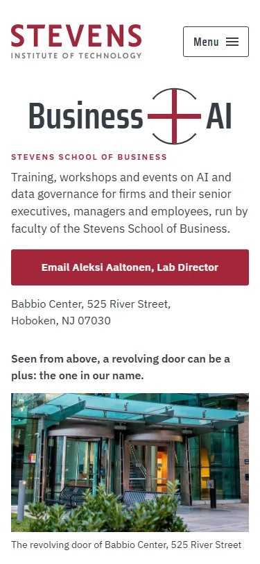
    Sample N, first screen on a phonePhone, first screen

    Seen from above, a revolving door is a “+” inside a drum, the same “+” as in the lab’s name, and the page sets a photo of the Babbio Center’s own door beside the drawing. Scrolling turns the door a quarter at a time, and each turn brings round one part of the lab: training and workshops, events, the faculty, and the email to the Lab Director.

    Claude’s fourth pick. The door ties the “+” to both the lab’s name and its building, and its four compartments match the offer one to one; it is the heaviest scroll takeover in the set, and it shares the name idea with M, so the meeting may want only one of the two.

    Steps outside the Stevens brand: it uses the “+” that belongs to the hackathon’s look, draws curved arcs where Stevens line shapes stay straight, and sets the name line at about ten times body size.

  3. Sample O: Sorting Floor

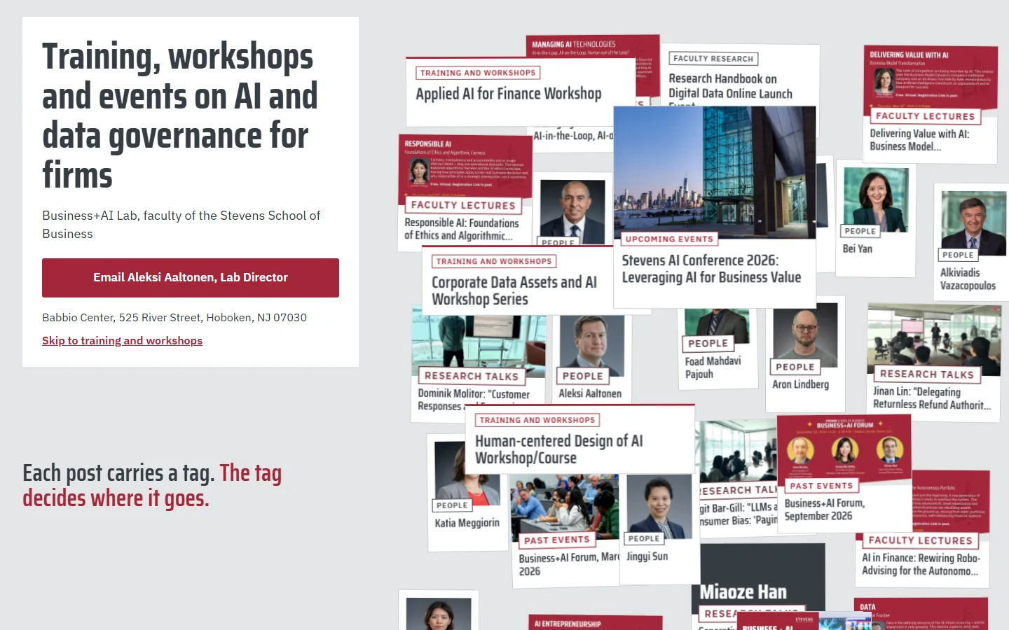
    1. Sample O on a laptop, moment 1: the unsorted heap of the lab's posts1The unsorted heap of 29 posts
    2. Sample O on a laptop, moment 2: scrolling starts the sort2Scroll: the sort begins
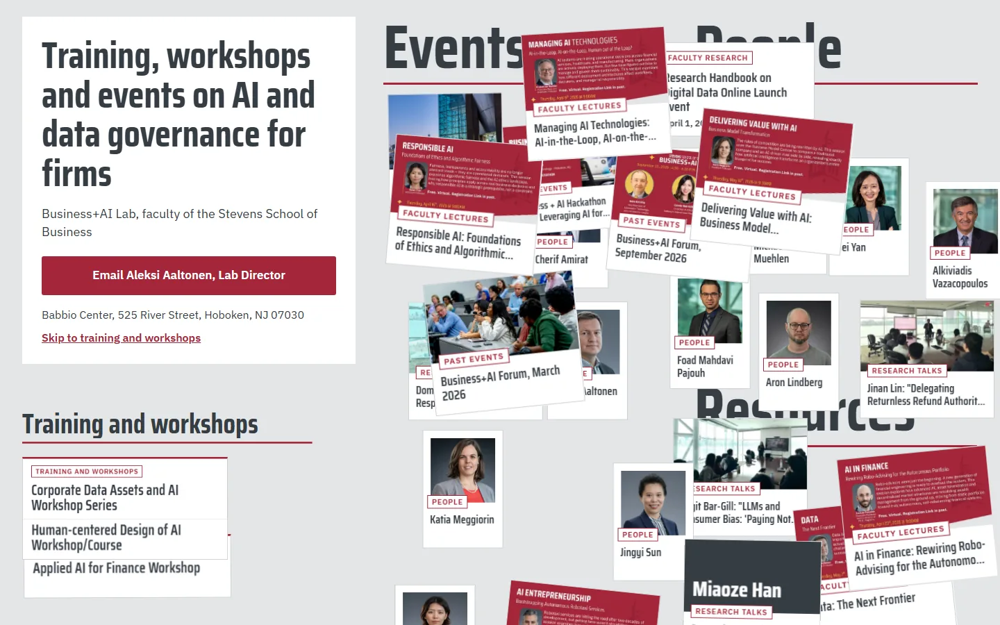
    3. Sample O on a laptop, moment 3: cards landing in their bins3Cards landing in their bins
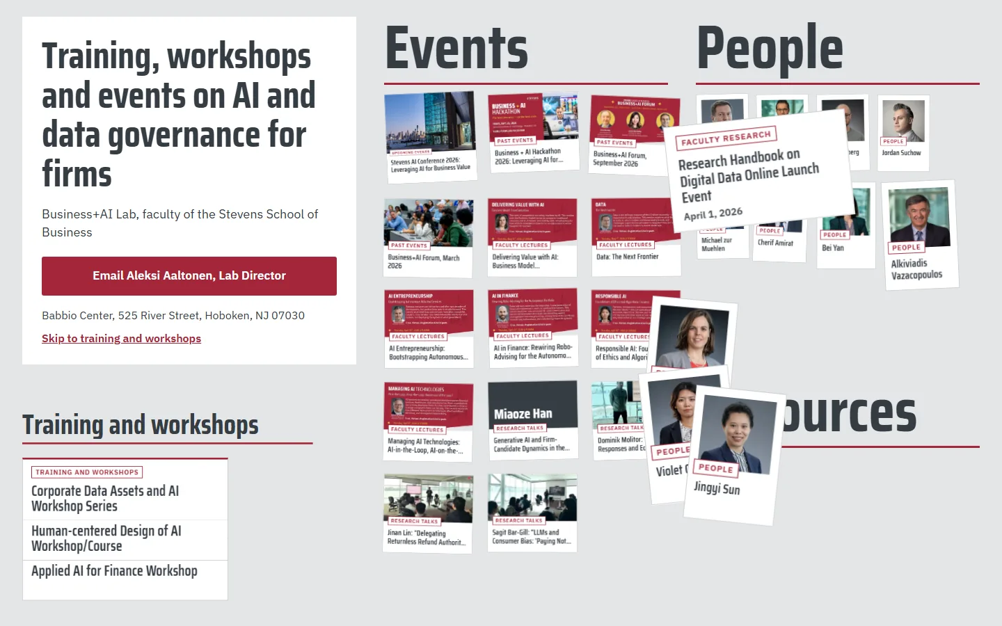
    4. Sample O on a laptop, moment 4: sorted into four sections4Sorted into four sections
    Sample O, first screen on a phonePhone, first screen

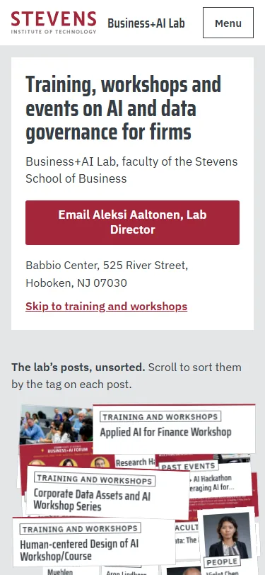
    Data governance starts with deciding what each record is, so the homepage sorts the lab’s own site: all 29 posts land as one heap of cards, each stamped with the tag the lab gave it. As you scroll, the cards fly into four bins (training and workshops, events, people, resources) that become the page’s sections.

    Steps outside the Stevens brand: a light gray floor fills the screen where the brand keeps light colours to small areas, the cards in the heap sit at angles, and Stevens Red is a small share of the first screen.

  4. Sample P: Data Double

    Claude’s third pick
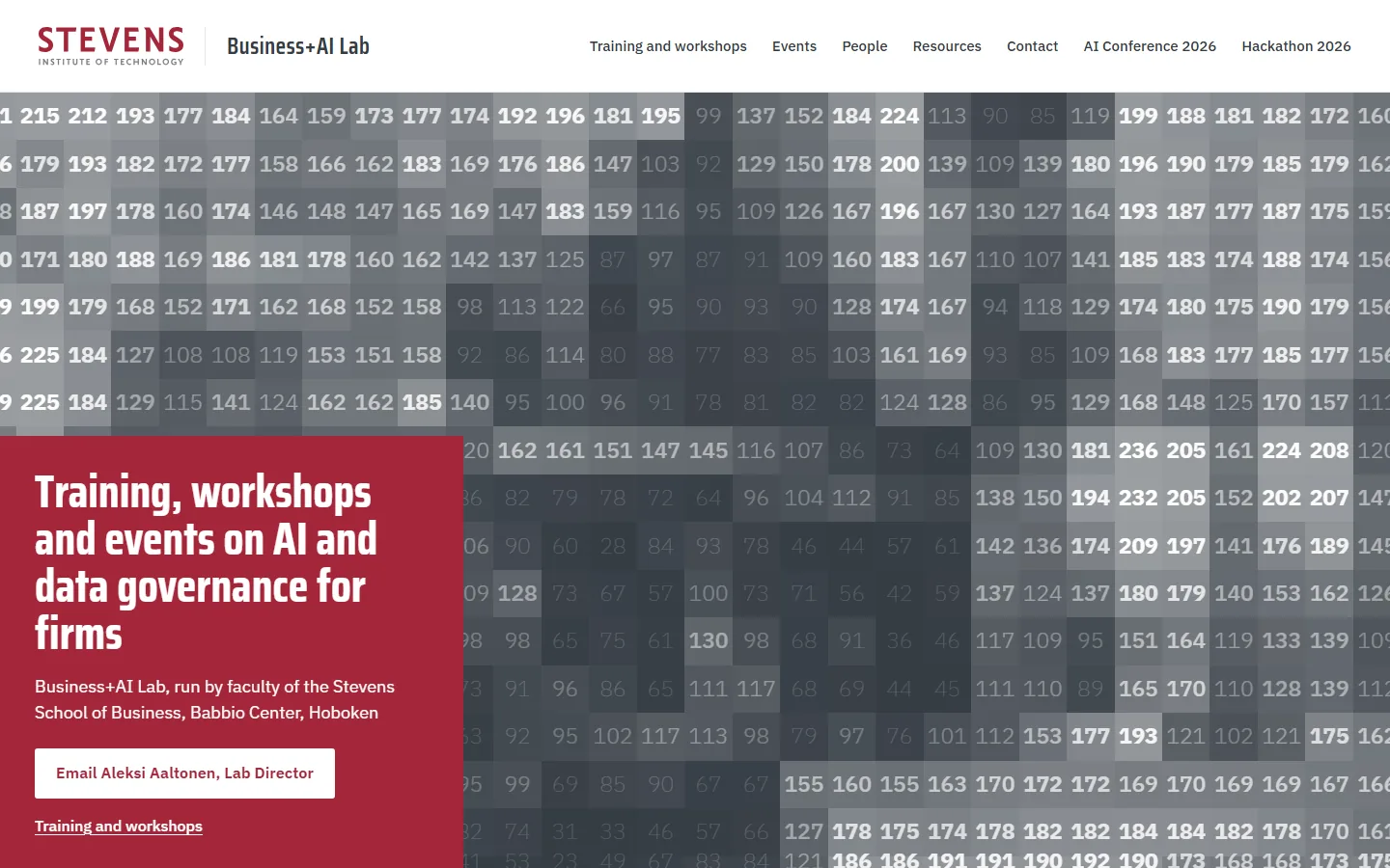
    1. Sample P on a laptop, moment 1: the Babbio photo and its numbers, split by the seam1The photo and its numbers, split by the seam
    2. Sample P on a laptop, moment 2: scrolling turns the facade to numbers2Scroll: the facade turns to numbers
    3. Sample P on a laptop, moment 3: the squares grow coarser3The squares grow coarser
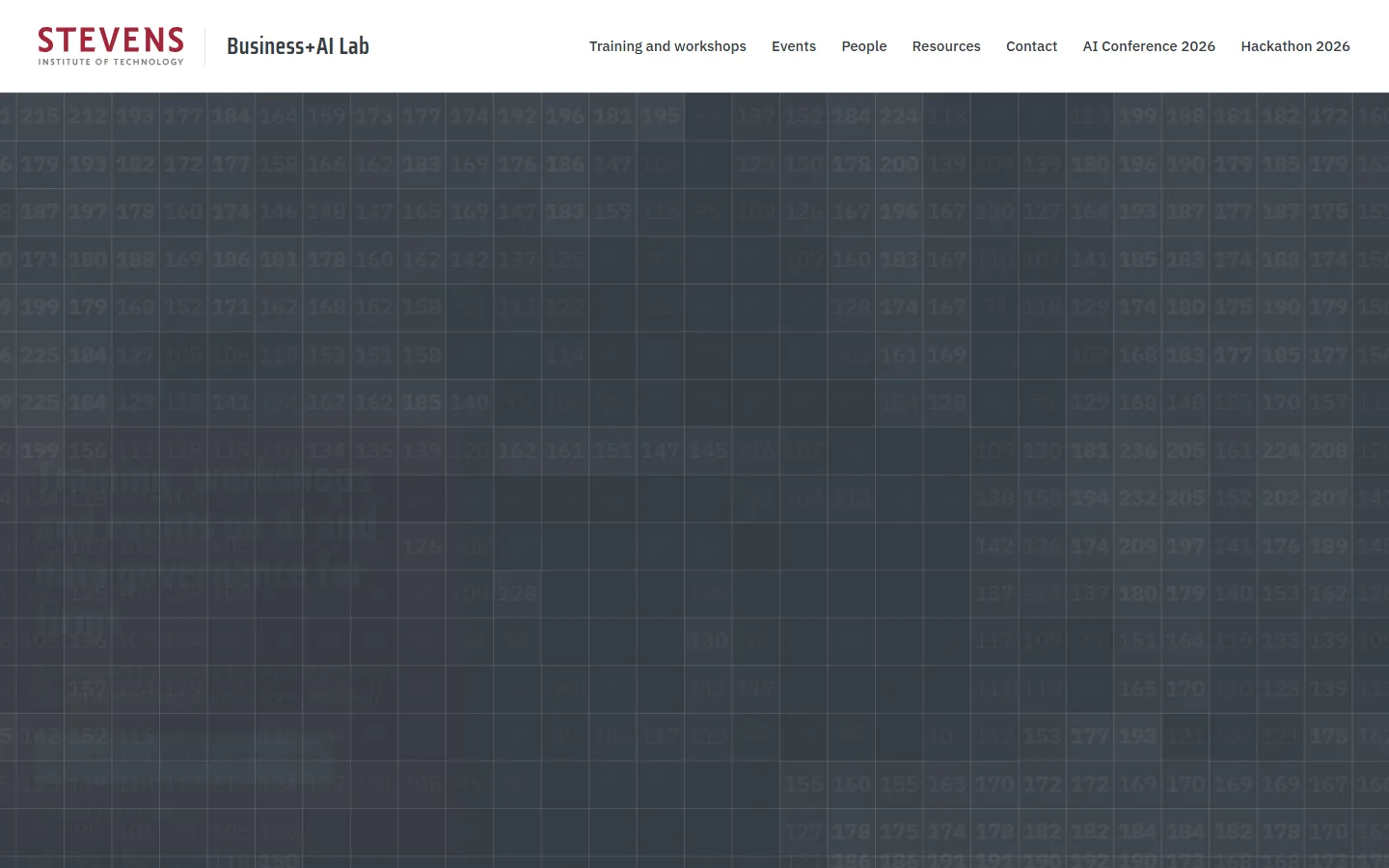
    4. Sample P on a laptop, moment 4: the numbers fade to grid lines4The numbers fade to grid lines
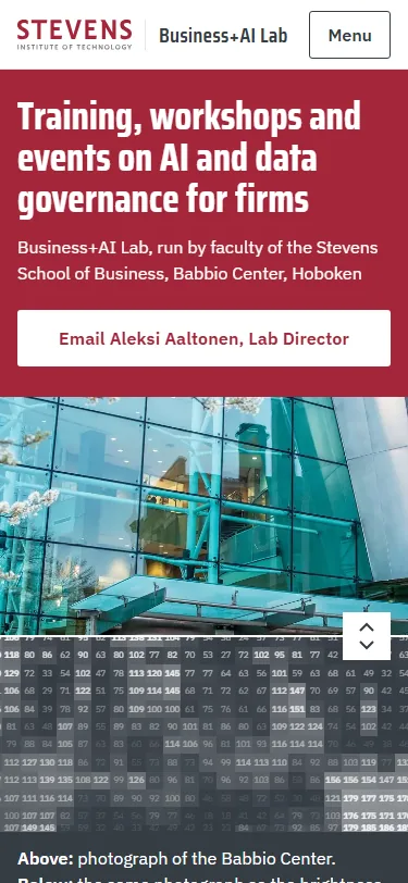
    Sample P, first screen on a phonePhone, first screen

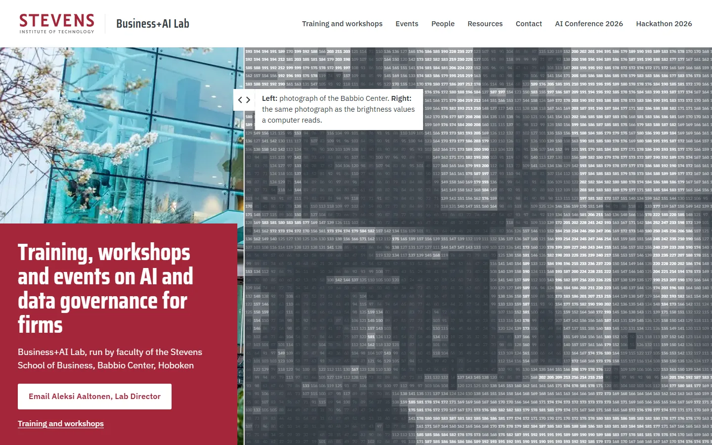
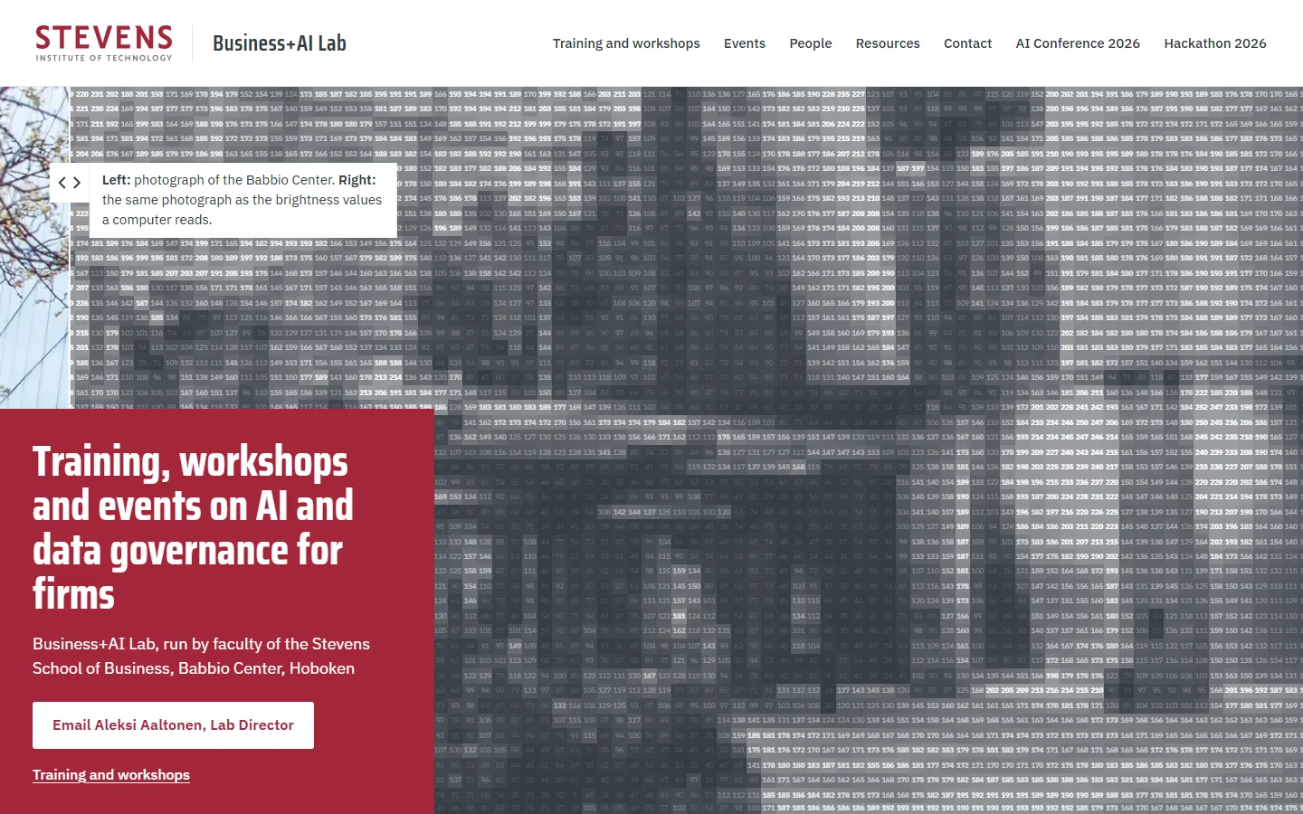
    The first screen shows the Babbio Center photo split by a seam: on one side the photograph, on the other the same photo as the brightness numbers a computer reads. The reader drags the seam across the building, a readout gives the real colour values under the pointer, and scrolling zooms into the numbers.

    Claude’s third pick. Its first screen is the furthest from round 1 and shows the lab’s subject in two seconds; against it, a photo shown as numbers is a familiar AI explainer, and the number grid means little to a manager.

    Steps outside the Stevens brand: the campus photo is shown as computed numbers and greys, where Stevens photos stay untouched, and the numbers are smaller than the brand’s smallest text (they are texture; the readout gives each value as text).

  5. Sample Q: Joining Words

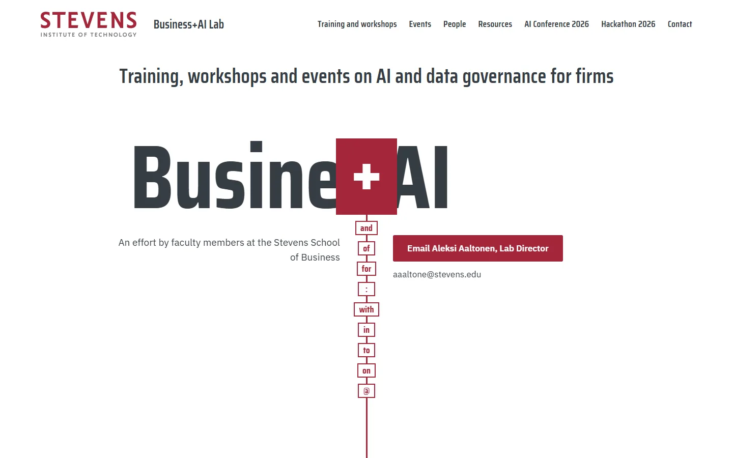
    1. Sample Q on a laptop, moment 1: Business + AI sliding into the red slot1“Business + AI” slides into the slot
    2. Sample Q on a laptop, moment 2: the slot alone, now holding 'and'2The slot alone, now “and”
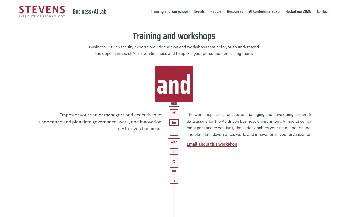
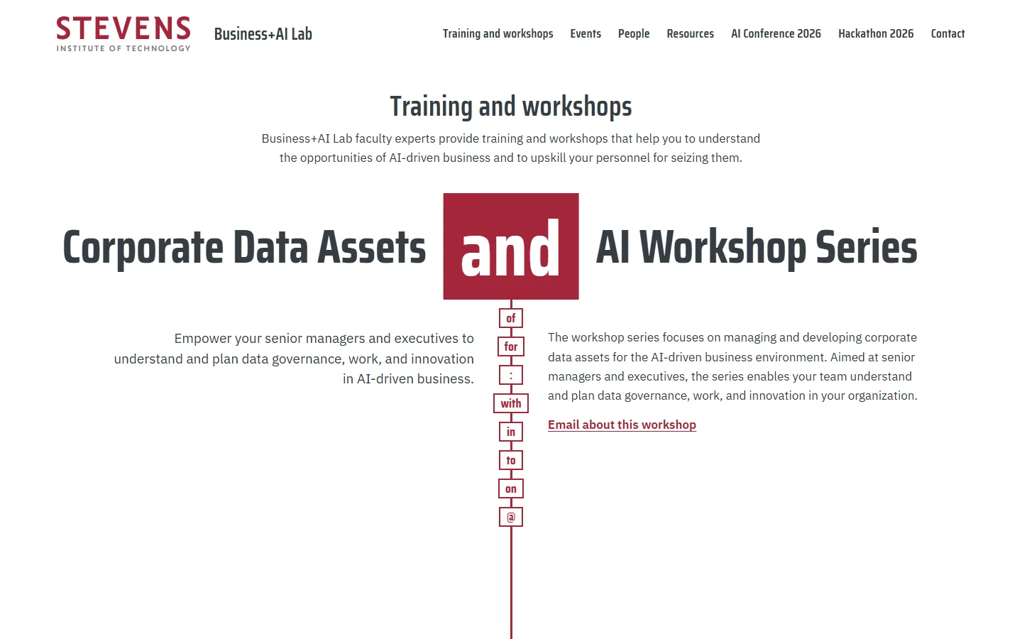
    3. Sample Q on a laptop, moment 3: the first workshop title held by 'and'3Workshop 1, held by “and”
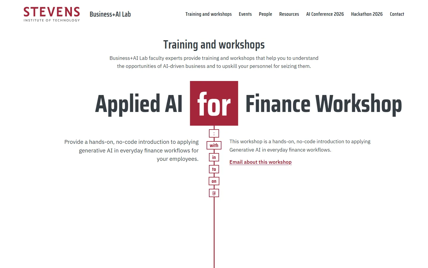
    4. Sample Q on a laptop, moment 4: the third workshop title held by 'for'4Workshop 3, held by “for”
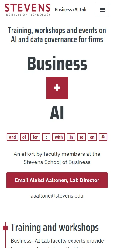
    Sample Q, first screen on a phonePhone, first screen

    Each of the lab’s titles is built like its name, two halves held by one small word (“Corporate Data Assets and AI”, “Applied AI for Finance”). A red slot in the middle holds that word while scrolling runs the real titles through it, from “Business + AI” at the top to the director’s address, joined by “@”, at the end.

    Steps outside the Stevens brand: title halves run up to about nine times body size, the faded rows use a faint gray as a text colour, and the lab’s official titles are split at the joining word, which Aleksi would need to approve.

  6. Sample R: River of Titles

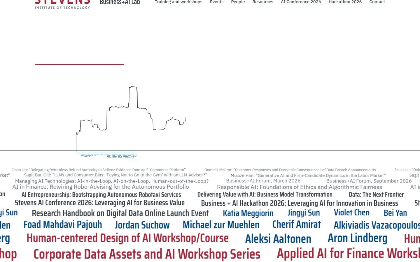
    1. Sample R on a laptop, moment 1: the river of titles under the skyline drawing1The river of titles under the skyline
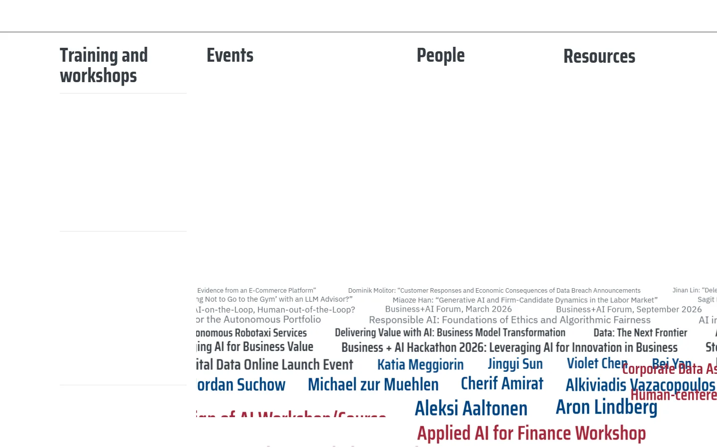
    2. Sample R on a laptop, moment 2: scrolling opens the index2Scroll: the index opens
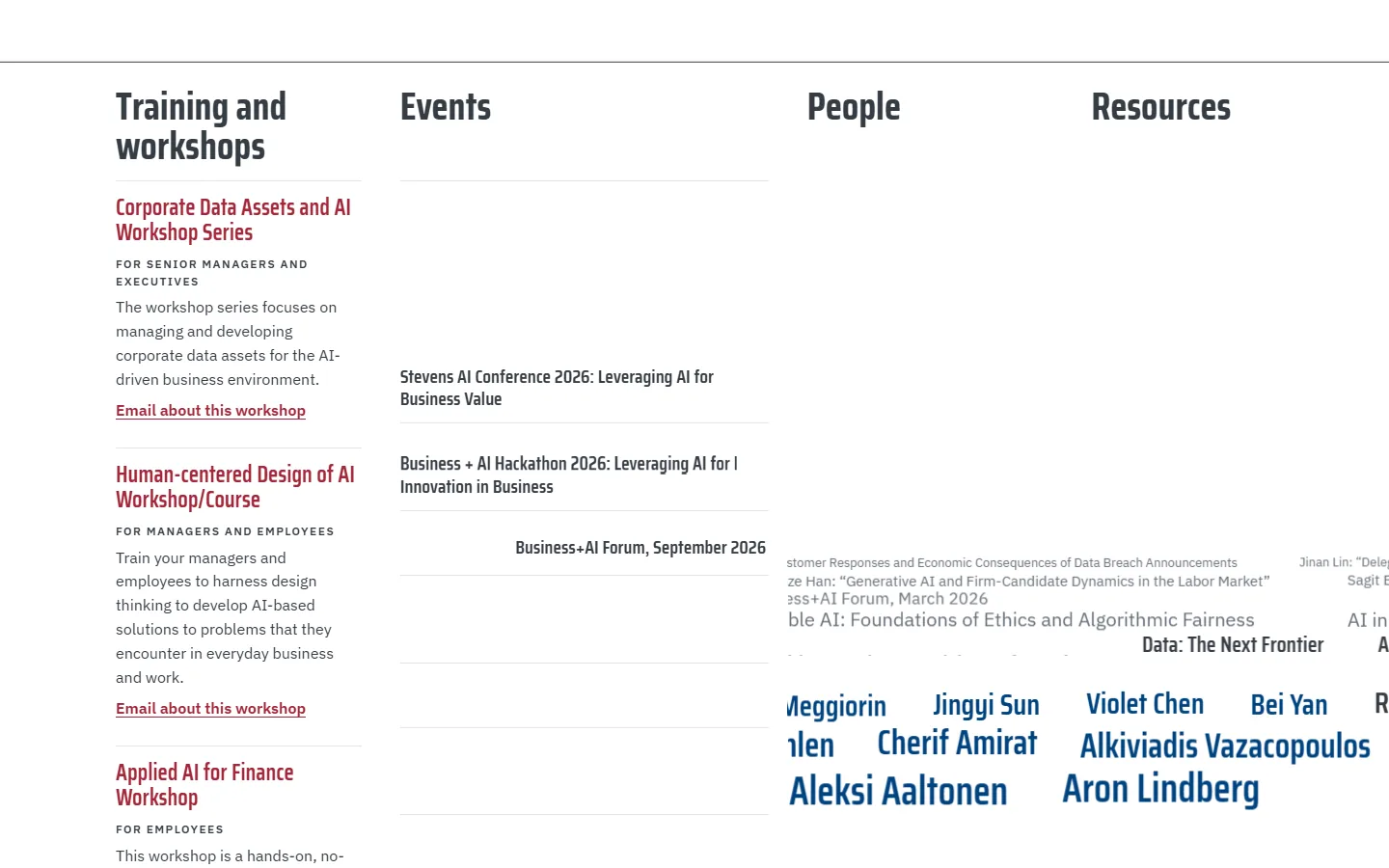
    3. Sample R on a laptop, moment 3: titles lift out of the river into the index3Titles lift out into the index
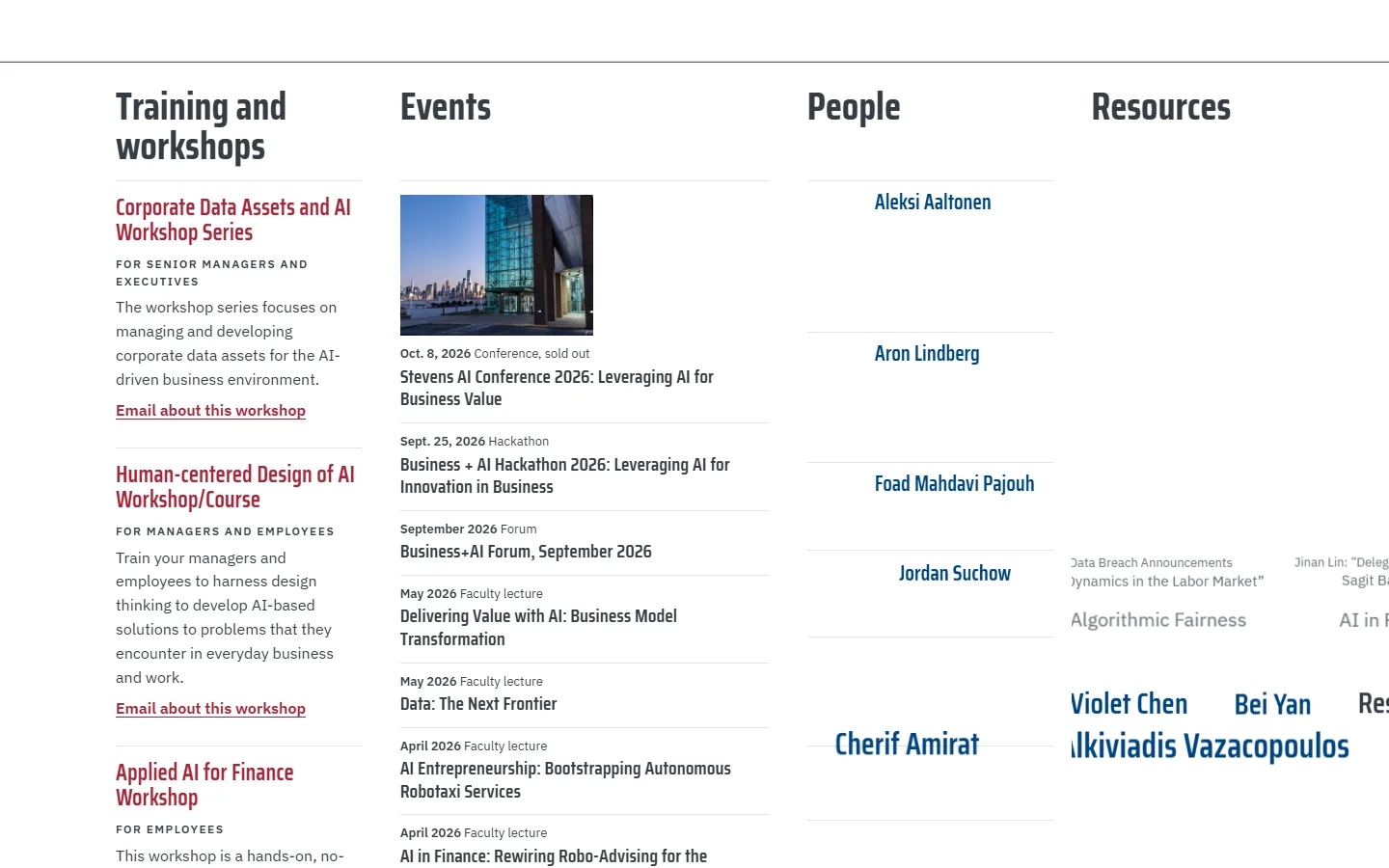
    4. Sample R on a laptop, moment 4: the index nearly filled4The index nearly filled
    Sample R, first screen on a phonePhone, first screen

    Every title the lab has published flows past the first screen in lanes of type, like the river in front of the campus, under a line drawing of the skyline across the water. The three workshop titles travel in red, and on scroll every title lifts out of the river into an ordered index.

    Steps outside the Stevens brand: Stevens Red is a small share of the first screen, the far lanes use a gray outside the palette, and the name and the lines under it have white outlines on their letters.

  7. Sample S: Live Index

    1. Sample S on a laptop, moment 1: the mission set large with topic keys1The mission set large, with topic keys
    2. Sample S on a laptop, moment 2: a key lights up2A key lights up
    3. Sample S on a laptop, moment 3: a line runs to the records3A line runs to the records
    4. Sample S on a laptop, moment 4: the matching records answer in red4The matching records answer in red
    Sample S, first screen on a phonePhone, first screen

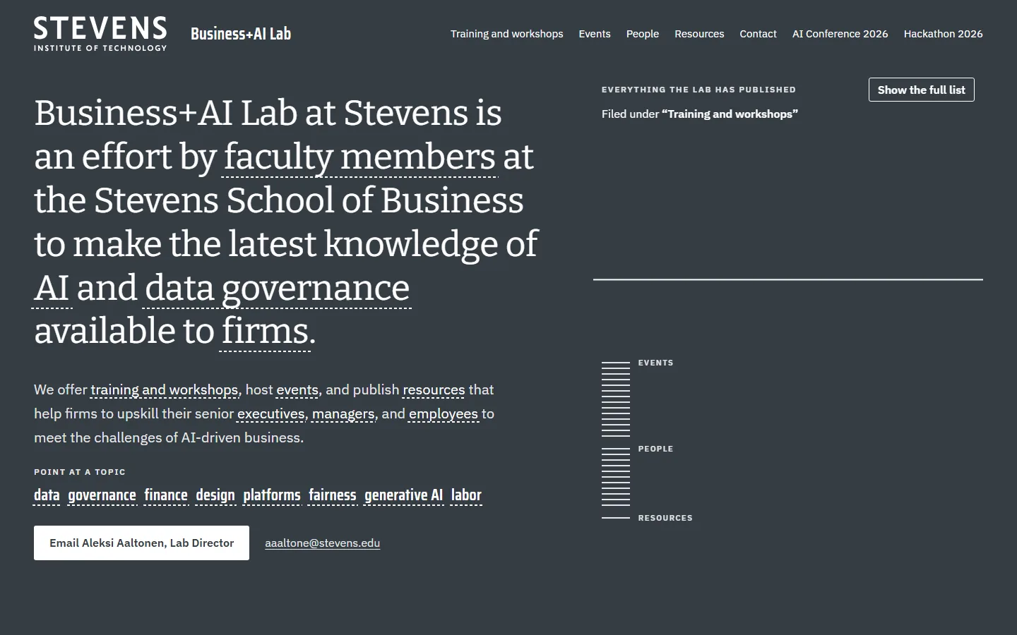
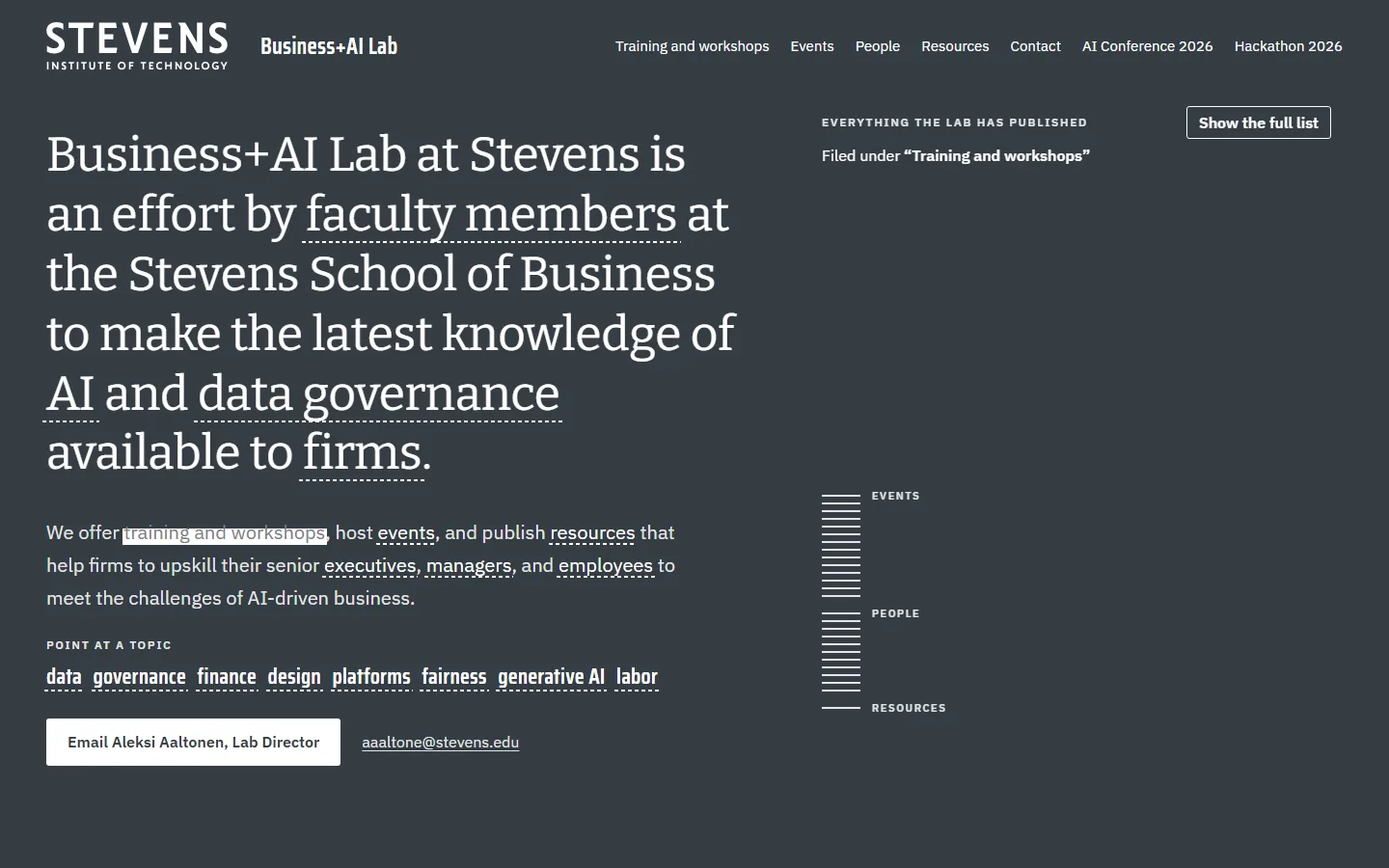
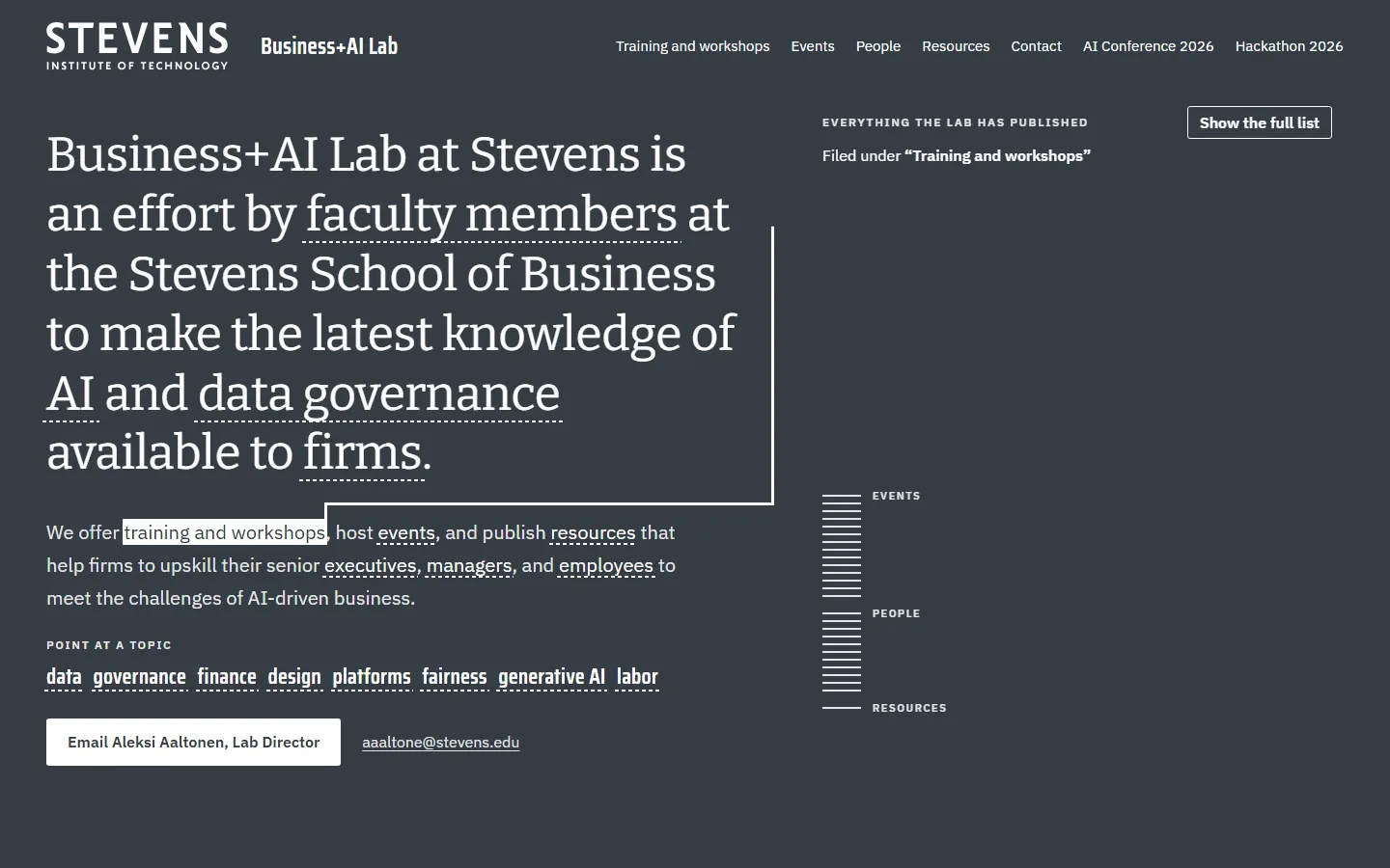
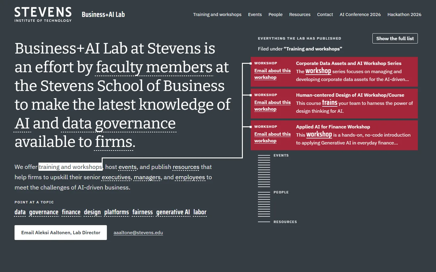
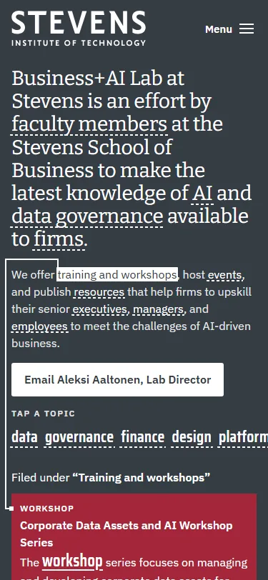
    The lab’s mission is set large, and its words, plus a row of topics, become keys: point at one and lines run to every record of the lab that contains it, each answering with its matching sentence. It shows retrieval with the source on screen, which is what data governance asks of any AI answer.

    Steps outside the Stevens brand: the mission is set in the Bitter serif, which the brand keeps for quotes, and Dark Gray fills most of the first screen while red shows only on the lit records.

  8. Sample T: Lines from Babbio

    Claude’s second pick
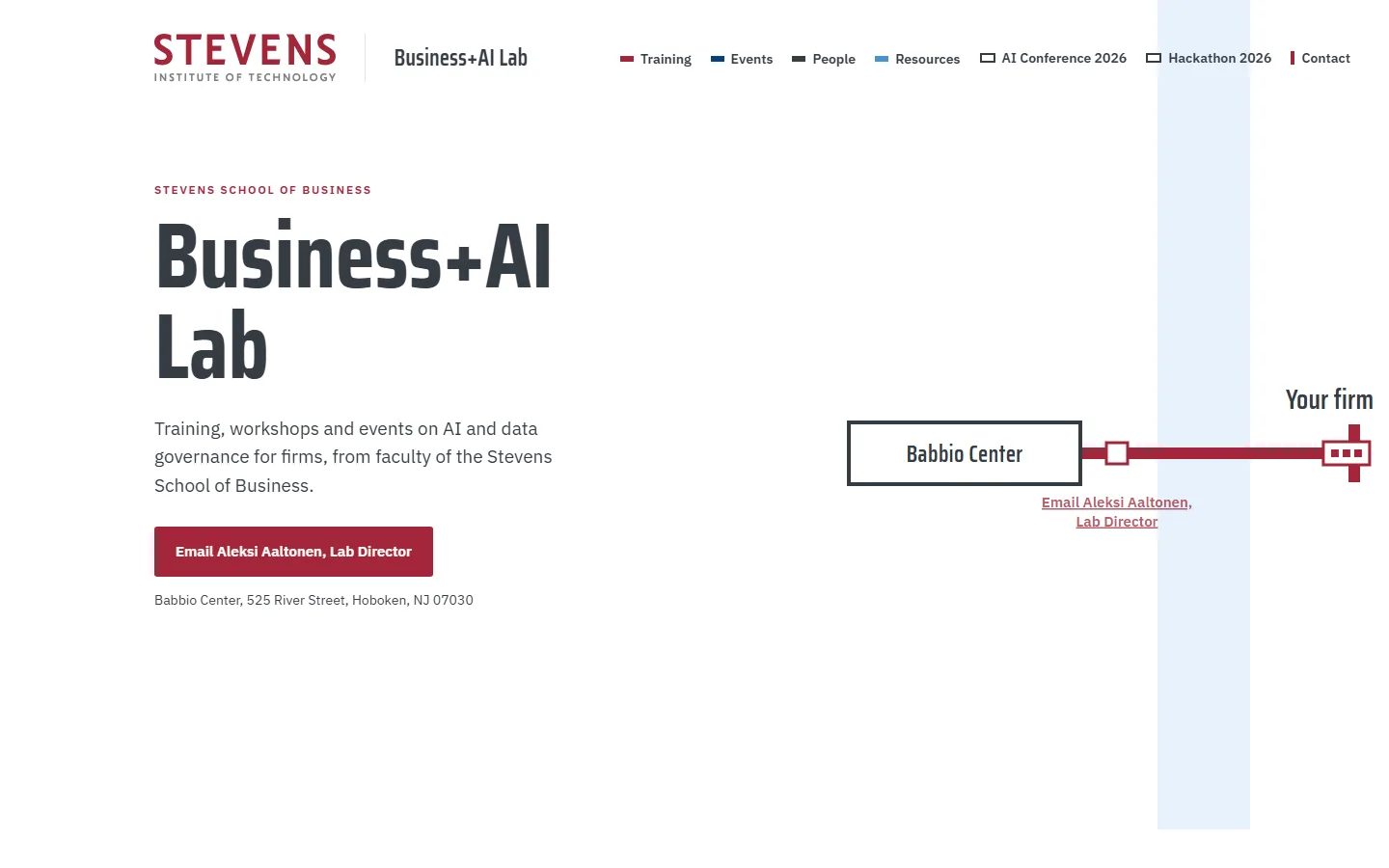
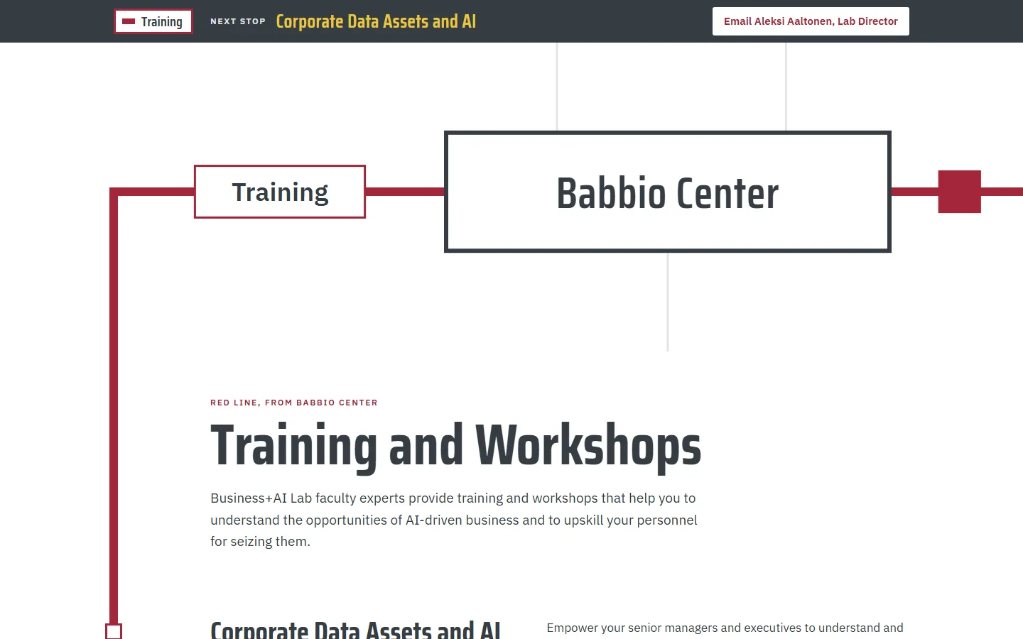
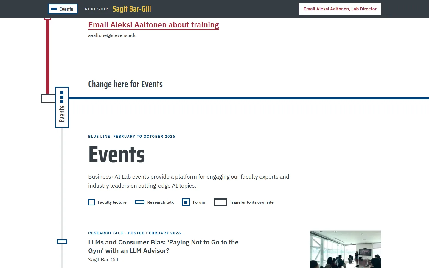
    1. Sample T on a laptop, moment 1: a train runs the red line from Your firm1Load: a train leaves “Your firm”
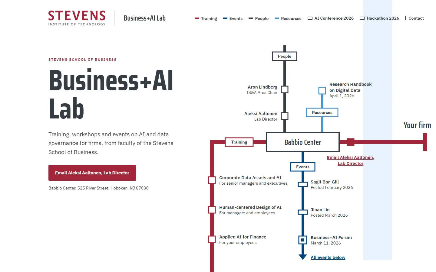
    2. Sample T on a laptop, moment 2: the full map at rest, every line from Babbio Center2The map at rest, every line from Babbio
    3. Sample T on a laptop, moment 3: scrolling zooms into Babbio and Training begins3Scroll: zoom into Babbio, Training begins
    4. Sample T on a laptop, moment 4: riding on, the change for Events4Riding on: change for Events
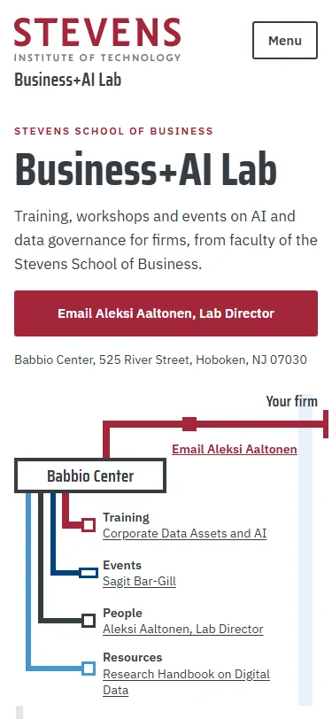
    Sample T, first screen on a phonePhone, first screen

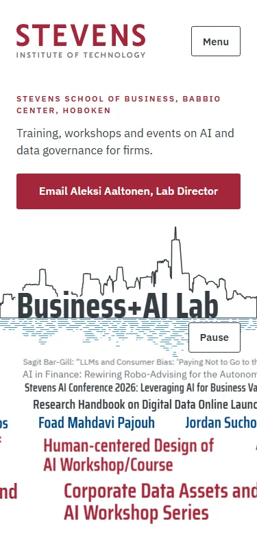
    The lab’s offer drawn as a transit map with every line starting at Babbio Center. The red line is the reader’s route, from “Your firm” across the river to the email stop and on through the three workshops, and scrolling zooms into Babbio so each line becomes the rail of its own section.

    Claude’s second pick. The reader review ranked it first, since the red line runs from “Your firm” to the email stop and on through the three workshops, and the motion review found it smooth; its weak spot is that a transit map is a borrowed picture with nothing in it about AI.

    Steps outside the Stevens brand: the map uses four line colours where the brand uses one per design, draws a river with two banks, and sets gold text on the ride bar; Stevens Red is about 2% of the first screen.

Kept from round 1

The favourite and the two rated OK in the first review, for comparison. Their links also open with motion switched on.

  1. Sample J: Business Plus AI

    Sample J, first screen on a laptopSample J, first screen on a phone

    Round 1: the favourite.

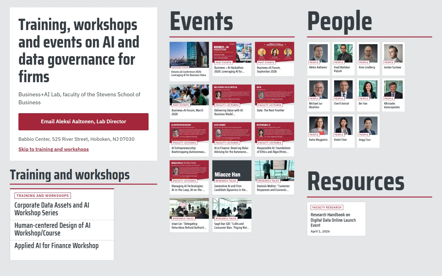
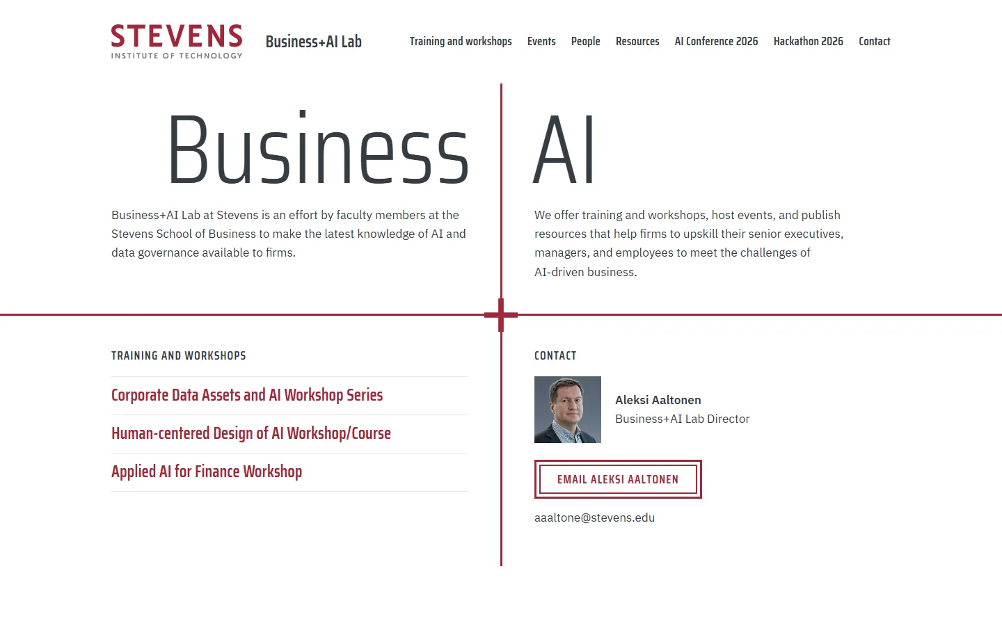
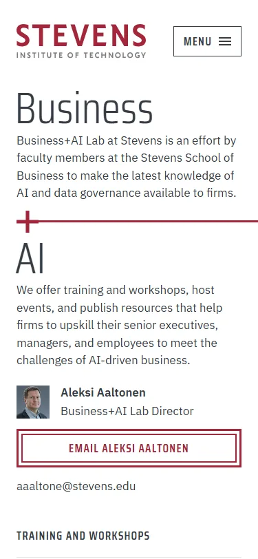
    The lab’s name splits the first screen: “Business” and “AI” set very large on either side of a red “+” whose arms run on as rules and divide the screen into four quarters.

    Steps outside the Stevens brand: it borrows the “+” that belongs to the hackathon’s look, and sets “Business” and “AI” at about eight times body size, twice the guideline’s ratio.

  2. Sample K: Dusk River Band

    Sample K, first screen on a laptopSample K, first screen on a phone

    Round 1: rated OK.

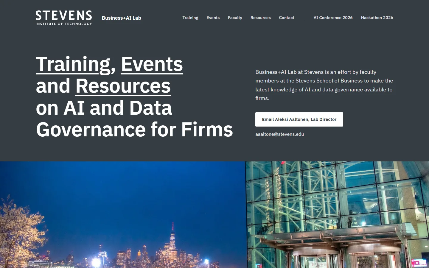
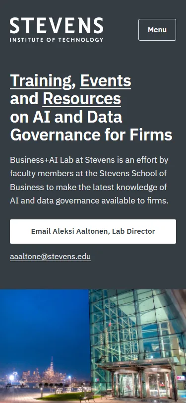
    An evening look: a dark gray first screen whose headline words link to the offers, then Babbio at night with Manhattan lit across the river, opening from an inset frame to full width as you scroll.

    Steps outside the Stevens brand: the headline is set in IBM Plex Sans where the guideline uses Saira for headlines, and the first screen is mostly dark gray with no Stevens Red.

  3. Sample L: Ask Builder

    Sample L, first screen on a laptopSample L, first screen on a phone

    Round 1: rated OK.

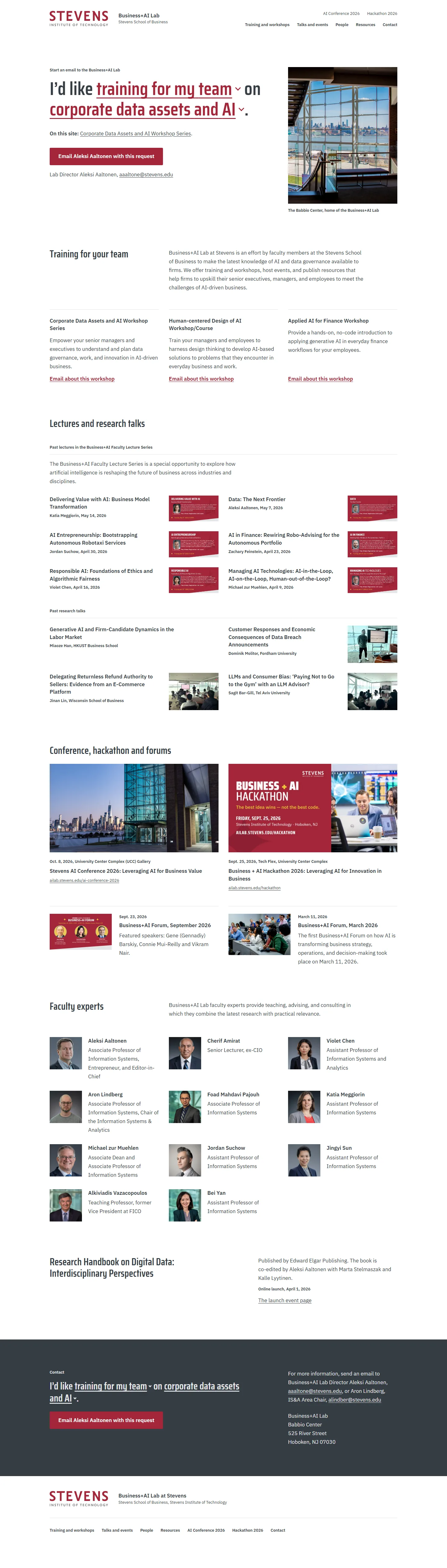
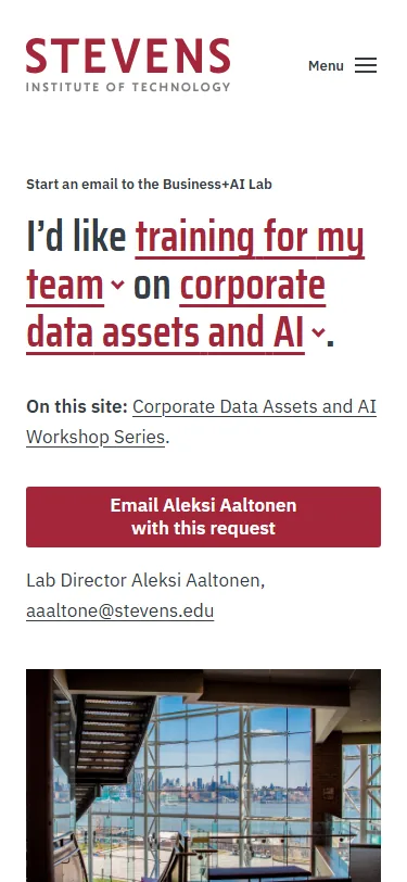
    One sentence the reader completes, “I’d like [training for my team] on [corporate data assets and AI]”, with both slots as menus of the lab’s own offers and topics; the finished sentence becomes the subject line of an email to Aleksi Aaltonen.

    Steps outside the Stevens brand: the two menu words are red inside a dark gray sentence, and the campus photo outweighs Stevens Red on the first screen.